Publishing House Brand Identity
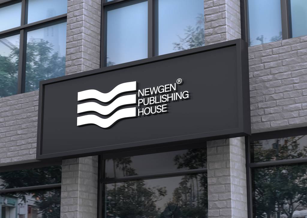
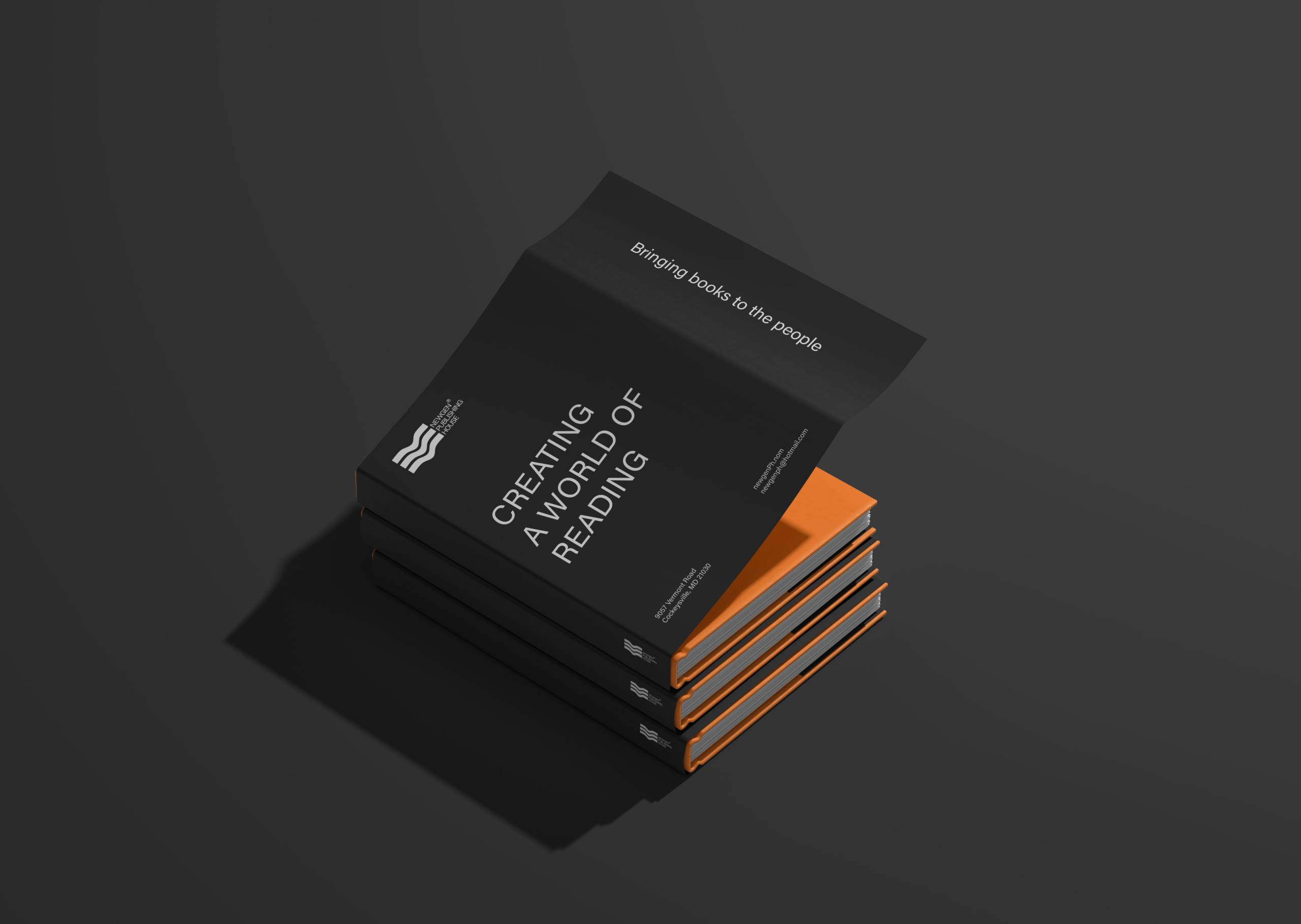
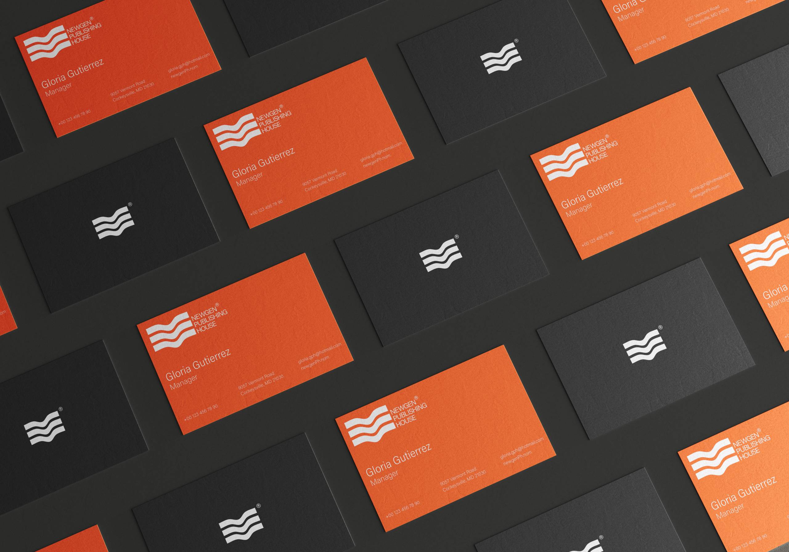
The brand identity for NEWGEN Publishing House is designed to reflect the company’s dedication to elevating literary talent and delivering high-quality literary works in various formats. The logo, which features three wave-like, geometric lines, embodies fluidity, creativity, and the dynamic nature of storytelling. The structured simplicity of the design suggests professionalism and modernity, symbolizing NEWGEN’s commitment to offering seamless publishing solutions.
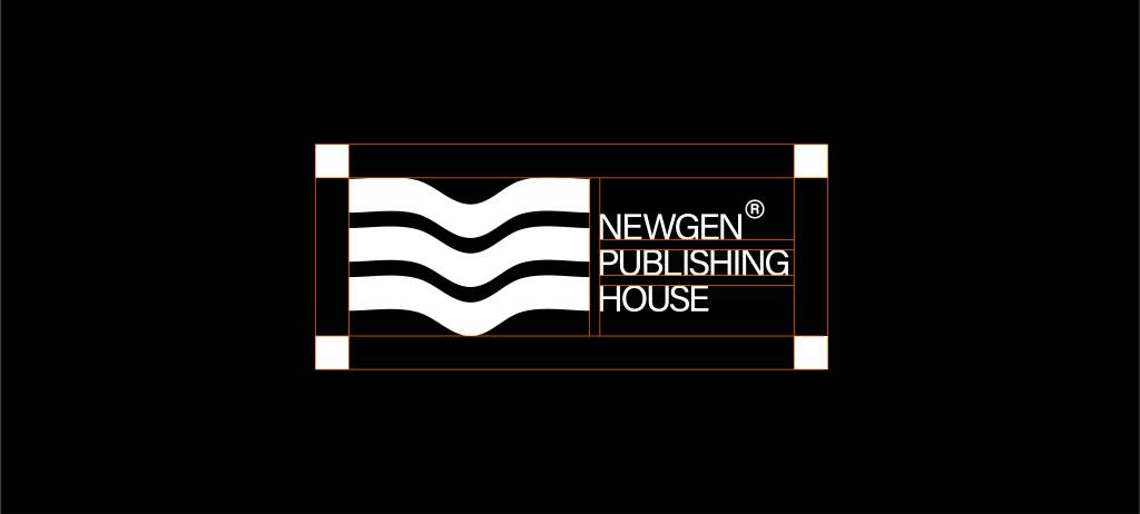
The symmetrical wave forms also evoke the idea of communication and connection, representing the flow of ideas from the author to the reader. The minimalistic yet impactful design makes the logo instantly recognizable, reinforcing the brand’s presence in the competitive publishing industry. With its bold and clean design, the logo aligns perfectly with NEWGEN Publishing House’s mission to support authors and share their stories globally.


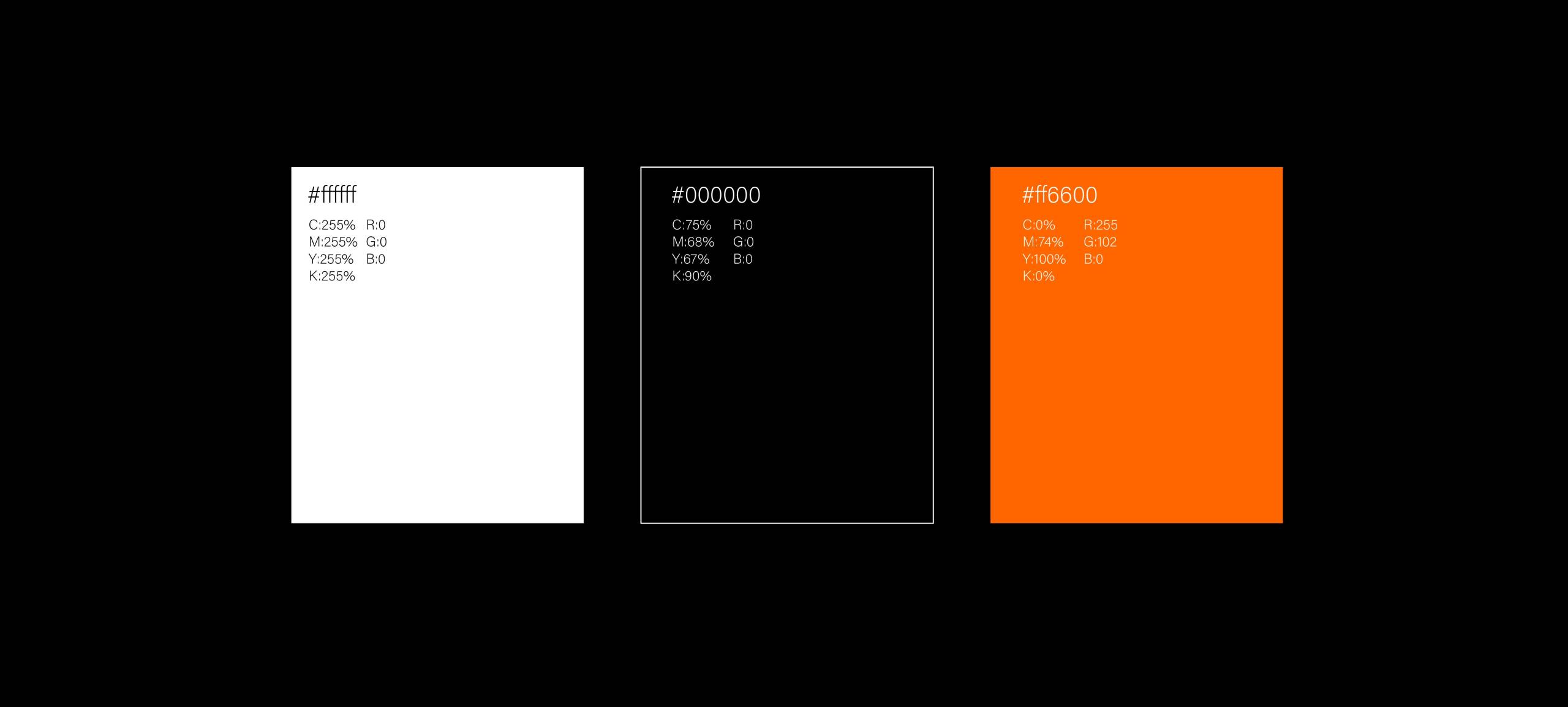
The color palette chosen for NEWGEN Publishing House enhances the brand’s bold and dynamic presence. The combination of colors reinforces the professionalism and modernity conveyed by the logo. The sleek contrasts create a visual hierarchy that draws attention to the brand’s core elements while adding vibrancy and energy.
The use of these colors complements the minimalist design of the logo, ensuring the brand stands out in the competitive publishing industry. Together, the logo and the color scheme embody NEWGEN Publishing House’s mission to connect writers with readers, blending creativity with professionalism to create a distinct and memorable identity.